It makes me wonder what in the heck the artists who made these covers were smoking when they designed them and what strip mall art school the creative director who approved them must have gone to. I've worked with designers - a lot of designers - and I'm intimately familiar with the approval process for creative work. I also know the pressure on these people to produce vast quantities of creative product on laughably tight deadlines. If you want an idea about the kind of stress these people undergo, fetch a blank piece of paper, set your kitchen timer for three hours, and design an ad for your favorite book/movie/music CD complete with font selection, line art, and color schemes, and while you're at it, make it look really pretty.
So, yes, these artists and their bosses get a healthy break from me because they have a rough gig. And I also understand that in a majority of cases, they are not given creative license to produce the covers they think are good but are forced to design to some non-creative person's idea of what is good. There is nothing worse than taking art direction from a person who thinks high art is achieved with Elvis on black velvet and that if your design program comes with 246 different fonts, there is absolutely no reason not to use as many as humanly possible. When the publisher tells the artist to show a passionate orgasm-imminent clinch between the hero and heroine and they must be standing on a raft floating in the middle of the ocean with a pirate ship looming on the near horizon and the heroine's hair has to reach to her ankles and the hero must be wearing nothing but an eye-patch and perhaps there should be a parrot in there somewhere, well, my heart goes out to that poor schmuck.
But even so, that's no excuse for the joke that ended up on the cover of so many romance novels. I'm talking about the mullet-headed men in the "pull-my-finger" poses or the women whose O-faces exhibit not so much complete ecstasy but rather a painful case of constipation. Come on. Who ever thought that looked compelling? What art director got that project file with the color proofs and said "Man, what a brilliant execution of love on a raft, and aren't these two hot? Approved. Print it."
Perhaps there is a special school out there for designers of bad romance cover art. The Acme School of Grotesque Man Titty and Tart of the Flowing Tresses.
In other words, it shouldn't be so dang easy for Candy and Sara to snark so well.
But...in the interest of defending both the genre I love and hope to find success in one day, and because I believe that some of the most talented people in the world exist in the creative design industry, I'm going to do the opposite of Covers Gone Wild. Here are a couple of book covers that I absolutely love. They are classy. They are well executed. The designers of these covers can hold their heads proudly because they done good.
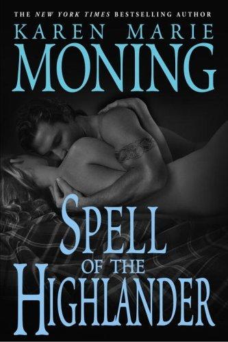
I owe Sharon over at WriteMinded a big thank-you for bringing my attention to this glorious cover. Actually, Karen Marie Moning owes both Sharon and her cover designer a big fat bouquet of flowers because this cover will probably sell me this book. I've never heard of this author or this series, but I'm so impressed by this incredibly sexy, tasteful and intriguing artwork that I'm dying to read the book. Only problem with a cover like this is that my expectations are very high for what I will find inside. This is a case of judging a book only by its cover and hoping against hope that I won't be disappointed.
This cover is simply lovely. I love the way the heroine is shown from the back, leaving me to imagine what she looks like rather than to roll my eyes over her romance-heroine-genericness. I also love her fairly modern posture in a clearly historical setting. This makes her look like a real person rather than an uptight medieval lady so bound up in her period clothing she couldn't possible be a living, breathing creature. And I confess that, in general, I prefer covers that have that water-color painting look rather than the photo-sum-original art of so many a clinch cover.

The premise for Stuart's Black Ice is what sent me looking for this book, and I would have bought it even if the cover had been a brown paper bag. But I was thrilled when the cover captured that sense of menace the story itself contains. It could be the middle of August and looking at this cover would send icy chills down my spine.

*Sigh* I love this cover. I love everything about it. I love the embossing that gives the flowing draperies so much texture. I love her wedding dress (and I'm completely capable of ignoring the fact that the heroine in this story never wears anything even closely resembling such a dress). I love the glimpse we get of the hero, again allowing us to fill in the blanks of what he really looks like. If I have a single complaint it's that perhaps the heroine's neck has been torked a little bit too much, leaving me to wonder if she isn't going to suddenly scream out in pain from a pinched nerve. Otherwise, I prefer this cover much over the reprint non-traditional version.

Okay, this is kind of a cheat. The original book cover for Wicked is something completely different. This cover is a result of taking the design art from the musical and applying it across the board. But I so much love the entire theme that I've included it here. Look at the way the designer has used line and shape to intertwine the Wicked Witch and the Good Witch. That wry smile on the face of the Wicked Witch hints of a sexy, funny, more-three-dimensional-that-pure-evil character. And what in the world is the Good Witch whispering to evoke such a smile? I've got to read this book! Or at least, I've got to get me some tickets to this musical.
And that is truly good art because it intrigues me. It asks me to look further, to come inside and discover the secrets only hinted at by a single image.
Dang. Hats off. I want the names of these designers so I can look them up someday.
2 comments:
I hadn't seen that new cover to WICKED -- I really love the old cover, but you're right, the new one is extremely eye-catching.
And I like the Garwood cover, too -- my version was the reprint. Although I'm not a huge fan of the clinch, I'm also not a fan of the blah blah landscape covers; they just seem too generic.
I enjoyed the Moning book - it was actually the cover two books ago that caught my eye and tempted me to start reading her work - but I had to put a bookcover on this book before I'd read it in public. Very pretty, very sexy, but I don't want to read a book in the work cafeteria that has nudity on the front cover!
Oh, I'll drool on it at home, and I think it's sufficiently artsy to be acceptable where the "bodice-ripper" covers aren't. But you should have seen the raised eyebrows from co-workers who saw the book on my desk (before I put the cover on it).
Post a Comment